Create Knockout Minimalist Food Photos
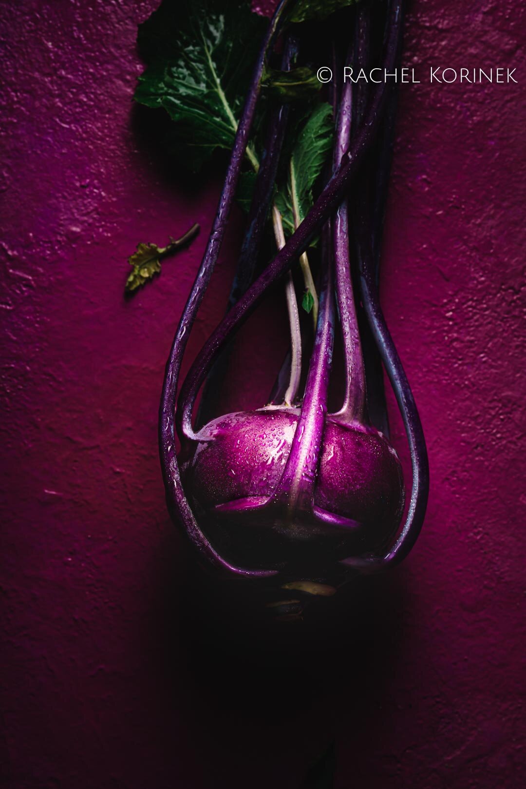
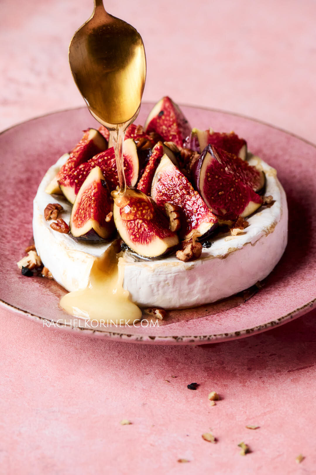
Have you ever tried a minimalist food photoshoot? Just one subject, when done right, man...it can pack a punch!
To me, minimalist images mean to create without excess. The food is the hero and doesn’t require any assistance from props in order to really shine.
The key to creating my knockout minimalist images is that I break the scene into two levels.
Macro, being the large-scale environment, meaning the image in its entirety, and micro, being the smaller-scale environments that make up parts of the image, environments and focus on compositional principles within those areas.
Composition techniques help me focus on placing a subject so it has organic movement and is aesthetically pleasing. I do this by focusing on layering, interest and placement to create depth, add dimension and interest for the viewer to explore. I aim for 3-4 layers of either food, props or both.
Ask yourself, can the food stand on its own and still be interesting?
Can you see where I’ve used interest in these minimalist shots?


